Here in Melbourne we’ve been stuck at home for the past few months (heck, years even!). Because of lockdown, I’ve seen many businesses needing and wanting to create an online space. This is what made me start to put my fingers to the keyboard. Here are some more useful tips for when you are creating your own Shopify store.
If you read part one of Make Your Store Pop & Convert, you’re anticipating another selection of tips to increase your Shopify sales by creating an effective, highly-converting Shopify home page.
Owning a Shopify site can be one of the most rewarding ventures you forego. Obviously, like all businesses, challenges come with owning a business. Now let’s put your strategy hat on, and be ready to get to work as we delve further into the Shopify hacks your homepage needs to stand out.
A bit of a refresher before we get started: What is the main objective of an effective Shopify home page?
To boost sales on your Shopify site and increase your conversion rate!
Here are some more actionable ideas and recommendations while you are setting up your Shopify home page.
Clear navigation
Getting lost online is never fun. Your navigation system is a roadmap for your visitors. It directs them to where they need to go on your site, and it should be easy to read and easy on the eyes. An organised and transparent navigation system is an important part of creating a positive user experience. It encourages visitors to stay on the site, read through your content, and ultimately buy more from you.
A Shopify website with a clunky, messy or overwhelming navigation and menu could potentially increase your drop-off and bounce rate. We don’t want all these prospects leaving your site and going to a competitor, do we?
An excellent way to keep your nav clean is through:
- Tell people exactly what they can expect: “Shop”, “Contact” and “About”.
- Be descriptive. If you have multiple categories or specific products, you can also use “Dresses”, “Silk Pillowcases” or “Toddler Toys” in your menu. This will not only help with SEO, but it also helps to stand out.
- Use submenus or a mega menu, especially if you have a lot of products and categories. Be mindful that you don’t want to encourage skipping on important pages. As a best practice, use “Dresses” as a main menu and “Long Sleeve Dresses”, “Cocktail Dresses”, “Summer Dresses” etc. as submenus. By creating a three-tiered “Shop” >> “Dresses” >> Subcategories you’ll risk low visits on these pages.
- Always include the Contact page in your main menu as creates trust and is a highly looked after page. If people need to search for this, your bounce rate might be higher and your conversion rate might be lower.
- As a rule of thumb stick to 5-7 menu items. If you overdo it, your visitors’ eyes are more likely may scan past important items. When your navigation has too many links, less authority and trust passed down to the interior pages, diluting your link juice.
Call-to-actions (CTA)
Think outside the box and imagine a call-to-action as a freeway exit.
Why? Freeway exits are short, hard to miss and advise of paths to take.
Ask yourself this:
- What makes you stand out from your competitors?
- How do you create a bond with new users and build loyalty with them?
- Is your website unique in style and aesthetics?
The call-to-action on your Shopify site should coincide with the steps a customer can take that meet the goals of your homepage specifically.
A user on your site should immediately understand where they need to click because your CTA button stands out from your site design. The harder it is for a customer to track the CTA button, the more likely they will leave your site.
Again, use clear wording on your buttons and CTAs, such as:
- Click To Buy
- Shop Now
- Order
- Add to Cart
- View Here
- Learn More
- More Info
- Check It Out
- Discover Now
- Send Me ___ Now!
- Click To Shop ___
- Claim Your ___
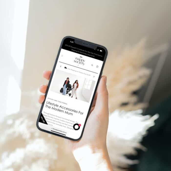
Eye-catching photos
We are visual people. The easiest way to get a visitor’s attention is through images that stand out straight away. Understanding what your visitor’s pain points and how your products solve them is crucial, and it will allow you to create emphasis on what’s important on your homepage.
In some instances, you are promoting a product or a variety of products to gain the attention of leads. The purpose of imagery above-the-fold (top part of your homepage) is to gain user attention on your website instantly.
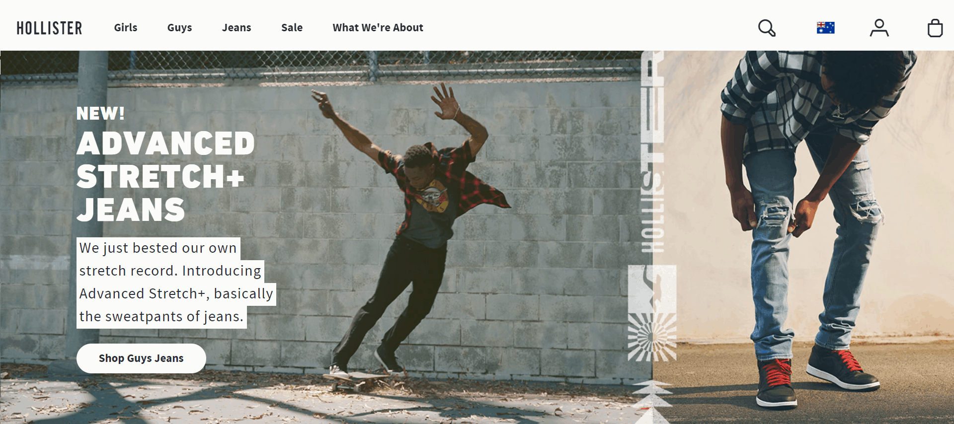
My secret: Use text overlay on an image to present your call to action.
When using text overlay, you are creating the visual link between the text and photography to create images in your visitors mind. They like the look of your product. They LOVE what it will do or mean for them. They NEED to buy this. NOW!
Be mindful to make the text overlay readable though. Do not use a busy image making the text impossible to read. If you do so, at least use a black or white overlay to make the text stand out and easy on the eye.
Adding a good headline as text over your image, also makes it clearer for the visitor what they are doing on your website, what they can expect, or what they should do next.
Lastly, the text overlaying an image is more helpful for SEO purposes than embedding this into an image. You don’t want to miss out on a better Google ranking, right?
Look at Hollister’s great example here:
Shopping cart accessibility
A customer must have easy access to an online store’s shopping cart at all times.
Shopping cart accessibility should be integrated when focusing on the site’s navigation. Ensuring the cart is either on the top left- or right-hand corner of the website with an added product count makes a transparent shopping experience for the customer.
Install a search bar
Complement the intuitive UX process by adding a search bar in your navigation menu. This way customers can search your store easily. If your store is quite large with lots of products, chances are you have some shoppers that will log on with the intention to purchase and leave promptly. The search bar is built for to assist customers like this (and helps you convert better).
When a website has a comprehensive collection of more than 30-ish products, the search bar minimises the time required for your customer to find what they are looking for.
My personal recommendation
Being in the industry for over 11 years and working with clients from various niche markets allows me to see the potential of e-commerce websites in detail.
Becoming a certified Shopify Partner takes time, research, and experience. To become your own expert, I recommend you focus on market research to see what works amongst competitors and other stores. Having the skill to dissect a Shopify site visually will help you see your store’s gaps and improvement spots.
Want a hand?
If you want to cut the market research and labour time to adjust your Shopify store, flick me a message here and you can book a discovery call with me!