Do you own a Shopify store, or looking to build one? Then you’ve come to the right place. This is a two-part article that features Shopify hacks for your homepage to help your store shine.
How can these tips and hacks help you? Hear me out and read further to understand how to think smart, not hard, to increase Shopify sales successfully.
In part one, we dive into understanding the following:
- What is the purpose of a quality Shopify homepage?
- How do you do this?
- Three technical tips: Eye-catching banner, captivating headline, and SEO-Optimised brand introduction.
What is the purpose of a quality homepage?
To have a quality homepage is imminent. Why? Because in more cases than less, existing and potential customers will start their journey with your store, starting with the home page.
You want your homepage to do three things:
- Welcome people to your Shopify website.
- Tell them what you want to do.
- Build a path that gives visitors the option to explore the store.
How do you do this?
Before you work out how and think of the following questions as a consumer:
- What does your website want users to do? I.E. Subscribe to something, purchase something and join an email list to list a few.
- Have you made it easy for your customer?
- What is the number of steps from start to finish?
Remember: Don’t complicate your homepage by trying to OVER design. This will be noticed.
Complicating the Shopify homepage is only a disservice to you as the shop owner. Less is more! Know what your customers want and then design to that blueprint.
Eye-catching banner
Anything “above the fold” (what you see first when you land on a page) is considered a vital component. Banners included! It is the banner’s job is to keep captivate your customers and tell them within a split second what they can expect from visiting your website.
A banner should highlight the following:
- What you sell: describe your most highly desired and unique feature or benefit. Say exactly what it is that you sell and/or what the visitor will get from your website.
- Keywords: people skim through and decide whether they stay or go within 0.3 seconds. Yup. Also, using keywords will help your SEO position.
- A hook that resonates to your target audience. Use the language and words that they speak. Now is not the time to be vague!
- Call to action. Please don’t forget this! Add a button to tell people exactly what you want them to do, such as “Shop Now”, “Contact Us” or “View ___”
When creating your eye-catching banner, keep in mind that it ticks the three C’s:
- CATCHY – A banner has a limited amount of text that can be keyed for a reason. Be clear with your message. Ideally your headline should be between 6 to 12 words.
- CONVINCING – Give customers a reason to read your banner. Compelling content that makes them go to the shopping cart!
- CONCISE – Keep it short and keep it sweet. Don’t use unnecessary words.
What do I recommend in terms of sizing and colours?
Formatting is also necessary in terms of a banner. Follow your brand guidelines and use your company colours to uphold flow throughout your site. When I’m putting a banner together, I like to compliment the text and colours with sizing. However, the recommended sizing depends from theme to theme. You should check with your theme documentation on the perfect sizing for all your hero banners!
Compelling headline
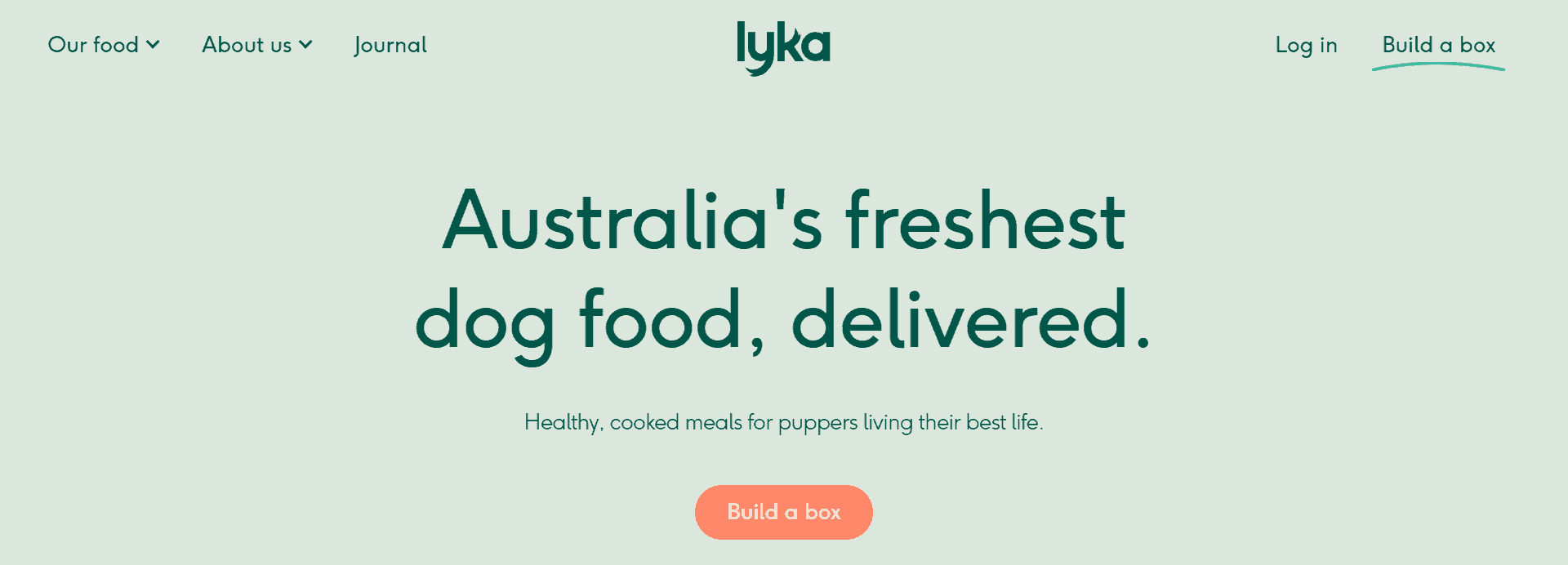
People make up their minds about your site almost immediately after landing on it. When checking out a homepage or landing page, their eyes immediately go to the details “above the fold”. This is what they see when they first land on your page. A clear yet captivating headline is a MUST! Sure, a “Welcome to our page” is nice, but now the visitor still has no idea what you do, what you sell, what they can find on your page? Eek! Frankly, I love a good headline.
When your Shopify store is in the web development and web design phase, it is crucial to understand that your headlines will carry your website through to the close of a sale.
Depending on your product, use words that can ultimately determine a user will buy from you. Touch the heartstrings and use emotional buzzwords like VIP Only, guaranteed, limited time only and buy one get one free. Showcasing your best offers and discounts will allow you to compete with bigger e-commerce sites.
The example from Lyka below ticks all the boxes:
SEO-optimised brand introduction
Thankfully, Shopify is an SEO-friendly platform meaning it is simple to get your SEO engine running.
To create ample opportunity for your store, see below a few tips from my SEO checklist that I use when working with clients on their stores:
- Optimise the site structure and keep it only a couple of clicks away. Example: Homepage >> Category page >> Product page.
- Use the right keywords to target users. To help you with this, think of at least five topics your customers are passionate about relating to your product.
- Optimise all Meta Titles and Meta Descriptions for products.
- Use links that go back to your product pages (= backlinks).
- Get creative and produce content that users want to see to keep them on your site.
That was it for now, but there is much more to touch base on. I will reveal this in part 2!
Need a hard boost of sales on your Shopify store but are time-poor? Click on the Contact page and book yourself a FREE 15-minute phone with me to discuss how I can be the Shopify specialist you never knew you needed!
Stay tuned, and I hope these simple recommendations can help boost your store into the next level.


