Building a website for your business should be fun and exciting. But if you’re not a pro it can be a bit overwhelming. Trust me, I know! I started building websites for fun when I was only a child and developed my skills over the years. I have done too many courses to count and endlessly watched YouTube tutorials to learn even more.
This got me thinking. When I was talking to my hubby Harlan about the gazillionth time I came across a DIY website that could use improvements, he spurred: “You should create a list of potential mistakes people could be making with the design of their site!” As a business owner, I totally understand that you’d might want to take on this project yourself to cut costs (which I encourage you to do!).
So here I am, typing away for you. Why? To help you see where improvements can be made and, most importantly, to help you save money whilst trying to get your business off the ground.
In the last 18 months, small to medium businesses in Australia and around the globe have taken a hit due to the pandemic. With most SMB owners cutting budgets, business owners take on all roles, which includes acting as the businesses web designer. Especially because the pandemic saw such a shift to businesses relying on their online presence.
As a web whizz, and an Australian biz owner, I hope these six potential mistakes made in the web design process help you create the best website for your business.
Mistake one: Not making a website mobile-friendly
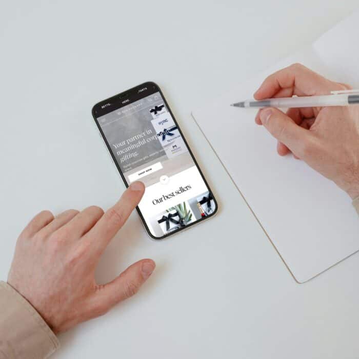
You can bet that a big chunk of your audience will view your website via mobile. In fact, over 56% of people use their mobile to browse online. To meet user expectations, build your website with mobile first in mind. Always. If you don’t then you can expect a high bounce rate, a decline in add to carts and a high rate of abandoned carts.
A website must be fully functioning on mobile devices to give users the best customer experience possible.
Mistake two: Not having a colour palette
Don’t underestimate the use of a colour palette.
Choosing a palette to represent your site shows consistency and is a simple website design method to executing an aesthetically pleasing and functioning site.
Every website needs a colour palette to showcase the understanding of flow and continuity throughout a site. If you’re designing your website, remember to use a Contrast Checker to make your website colour compliant with the Web Content Accessibility Guidelines (WCAG). Colour contrast is an important component of creating a more accessible web for all users including the visually impaired. To make your text easy to read, the contrast between the text and the background should be high. Use this colour contrast checker to determine whether or not your colour combinations are accessible or not.
Mistake three: Bad typography habits
When fonts aren’t used effectively and correctly, the website will look incomplete and like a ‘home job’.
What’s a home job? When someone that is not a web designer builds a site.
Having set font styles, spacing & colour on your site will show flow and consistency. If you avoid building a website by these rules, you’ll have a website that looks inconsistent, uncared for and makes it too difficult to read as the flow will be out of place.
Fonts say a lot about your brand. You could use your actual branding fonts or choose a font or two that represent your brand. The most popular font types are:
- Serif – these usually look more traditional and reliable
- Sans serif – these fonts convey modernism, strength, and style
I recommend using a maximum of one/two web fonts across your site. Try to stick with serif or sans serif fonts and don’t (over)use script or handwritten fonts. These tend to be harder to read, making your website more prone for users to bounce. Italic (cursive) fonts tend to look more playful and could suit some businesses depending on your target audience or product/service. But used wrongly, they can look a tad unprofessional.
Don’t forget to have a set font style and size for headings, quotes, information, and product descriptions. This will, in turn, help the viewer stay on your website and continue to navigate through.

Mistake four: Your call-to-actions aren’t clear enough
Put yourself in the user’s shoes for a moment. When you don’t tell a site visitor exactly what to do and where to click, the viewer will struggle to understand what is wanted from them. This might cause some misunderstanding and makes it harder for them to navigate through your pages.
The secret? Make your call-to-actions simple and to the point.
I’ve recently taken this amazing copywriting course. One phrase really stuck with me though. The teacher said: “Even the smartest humans can get easily confused when it comes to following instructions online.” Always be as clear and direct as you possibly can.
Here are my favourite examples to boost traction with call-to-action:
- Learn more
- Discover
- Explore
- Continue reading
- Add to cart
- Sign up here
- Find out more
- Check out more
- Show me ___
- Talk to us
- Try ___
- Start ___
- Start shopping here
Mistake five: not focussing on image formatting
A picture is worth a thousand words. With all our screens now being Ultra HD, your images need to be too. There is nothing worse than having unprofessional, distorted or blurry images on your website. You could easily expect users to close their browser and end their journey earlier than expected.
Why? Because no user likes to look at bad imagery. It can be deemed unauthentic or understood that you pasted that image from a wholesaler site.
Make your images crisp and clear and ensure the sizing is cropped correctly to fit across all screens. Avoid uploading extremely large images, as that will slow down your site. You are best to crop your images to the perfect size (such as 1920x1080px or 1000×1000 px) and export it for web use. This ensures your website won’t slow down and stay as speedy as possible.
Mistake six: Bad UX and broken links.
User Experience (UX) is tres importante as it helps your website to convert better and reduces your bounce rates.
If you aren’t a web designer, put your user hat back on and think for a second.
Ask yourself: How can I make the user experience simple and easy to follow?
The answer: create a site architecture, leave out unnecessary text and links, and most importantly, check out what competitors are doing and why they are succeeding. By no means copy their stuff, but use their sites as a reference and guide when building your navigational links.
If you see a trend that works, stay ahead of it.
My little extra tip: when your website is ready to launch, use Dr Link Check to crawl for any broken links and fix them. You don’t want anyone landing on that 404 error page!
As a web design freelancer, I understand the sweat that goes into building a website that represents YOU (and also converts). Our reviews are a true testament that our “method to the madness” works. My hubby and I are Australian web designers, and we thrive on assisting small businesses around the country, especially when a helping hand is needed.
Are you still stuck and advice or someone to make the adjustments for you? Click on our ‘Contact’ page, fill out the ‘Get In Touch’ form, and we will appoint a designer to your site to increase lead conversion at a faster rate.
Siri the Agency sends well wishes to all businesses and individuals through this time as we work together to building a better economy for the years to come.


